
Parabellum Martial Arts
Eyebrow Text Here
Fierce brand, made consistent.
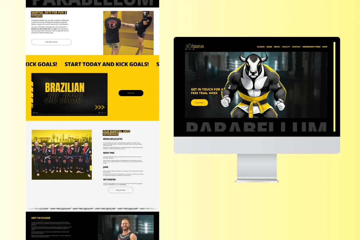
Parabellum Martial Arts wanted a sharper brand and a stronger presence online, to bring in new members and serve their community better. They already had the raw material: a striking bull-skull logo and a bold yellow-and-black palette. What they didn't have was consistency, or a website and sign-up process that kept up. We tightened the brand, rebuilt the site, took their member sign-ups off paper, and gave them a set of marketing materials to match.
The brief.
Parabellum had a strong identity to start with. The bull-skull logo is all fierceness and fearlessness, and the yellow-and-black palette hits hard and reads instantly. The problem was consistency: that identity looked different from one piece to the next, with no set rules holding it together.
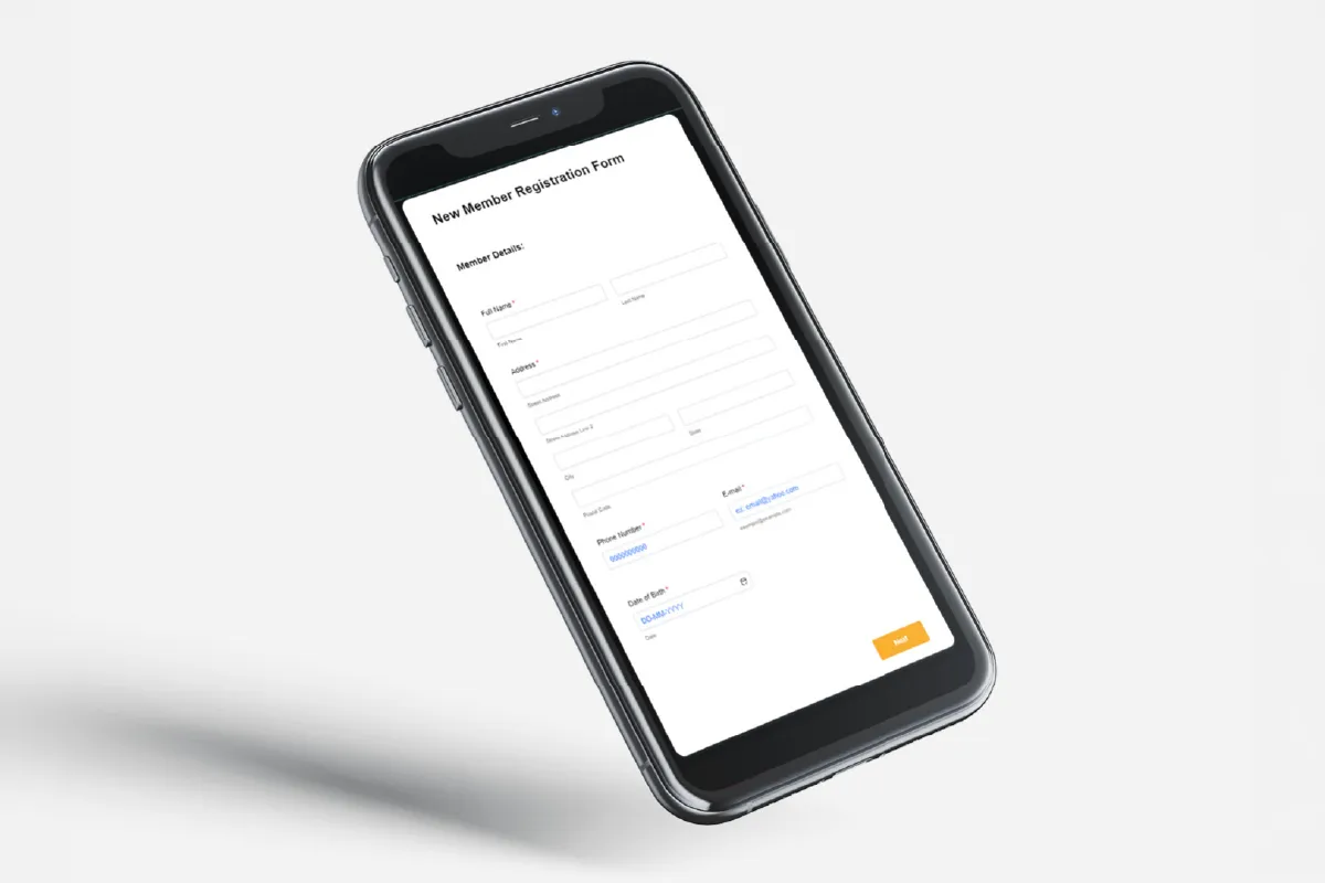
Around it, the practical side had fallen behind. The website was clunky and didn't work on a phone, and new members still signed up on paper, forms Tom had to hand out, collect and file by hand, with no searchable record at the end of it. They wanted the brand sharpened and the whole setup brought up to date, so it was easier for new members to find them and join.
At a Glance
Client: Parabellum Martial Arts
Industry: Fitness (martial arts club)
Scope: Brand refinement, website on Squarespace, a digital member sign-up form, graphic design and marketing materials, and a promotional video.
Fierce, kept fierce.
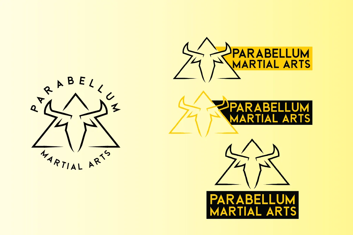
We refined what was already working rather than replacing it. The bull skull stayed, and we leaned into the fierce, fearless character it already carried. So did the yellow and black, now locked to set colour codes so they stay the same everywhere. We drew sharp, triangular angles out of the logo's own lines to run across artwork, giving every piece a common thread, and made the logo more flexible with horizontal and stacked versions that put the business name front and centre.
A website that works, and gets found.
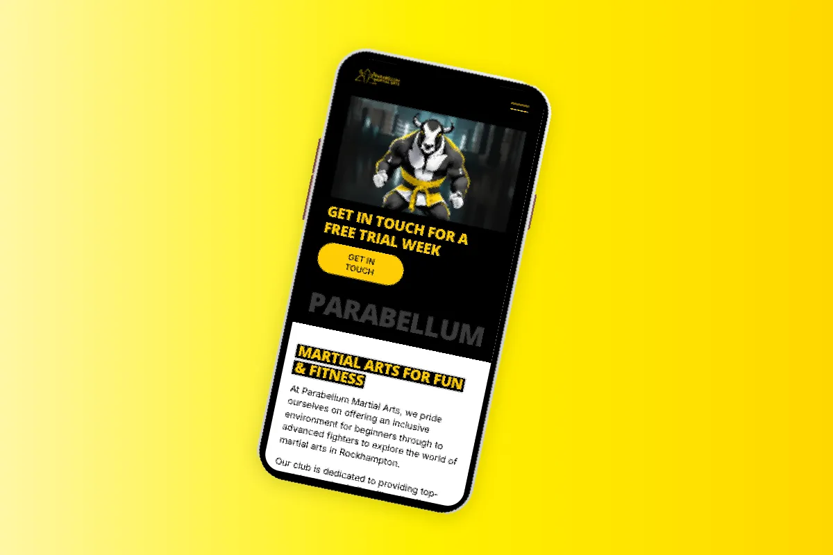
The old site was clunky, didn't work on a phone, and search engines struggled with it. We built a new one on Squarespace with fresh content, made for mobile first, and shaped around keyword research so the club actually turns up when someone searches for martial arts nearby. It's faster, easier to use, and doing the job the old one wasn't: helping new members find the club and join.
Marketing Materials
Eyebrow Text Here
Bold designs to match.
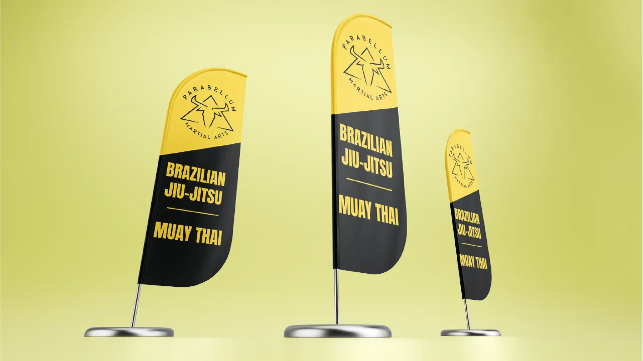
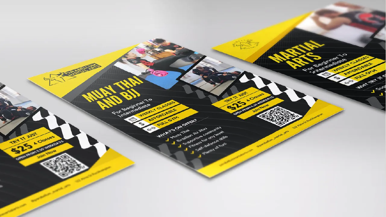
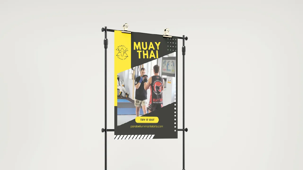
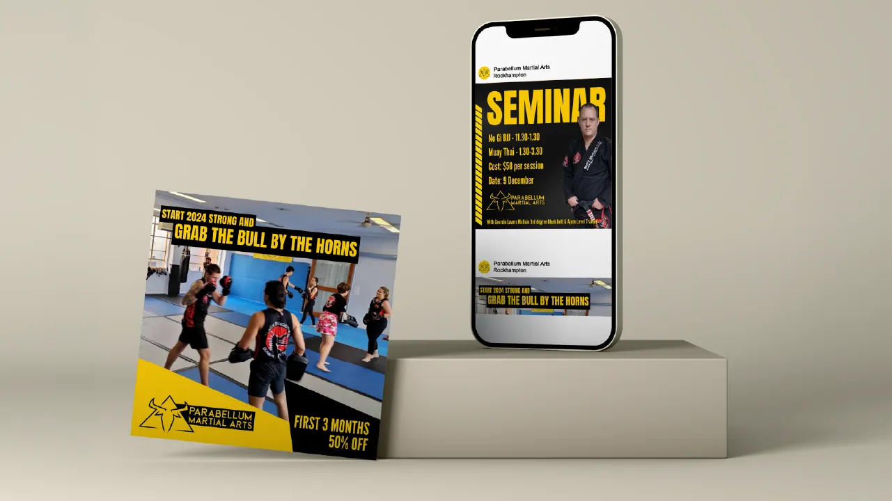
With the brand tightened, we rolled it out across everything the club puts in front of people: flyers, posters, social templates, flag banners and a promotional video. We worked with Tom to pin down what actually sells Parabellum to a prospective member, and made sure every piece says it clearly and looks the part.
Where it landed.
Parabellum came away with a brand that finally holds together, a website that pulls its weight, and a sign-up process that runs itself instead of running Tom. The identity was always bold. Now everything around it is too.
"Kat is a marketing expert who knows all the latest techniques to maximise return on investment for your business. She created a fantastic website that has driven much more traffic and enquiries to me. I couldn't be happier with the work she's done."
Tom Greensill • Parabellum Martial Arts.