FBA
Eyebrow Text Here
A brand to match the work.
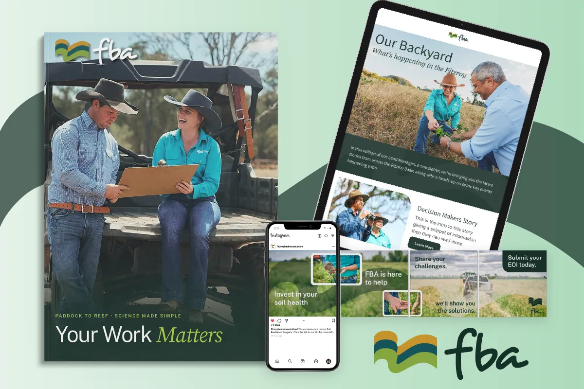
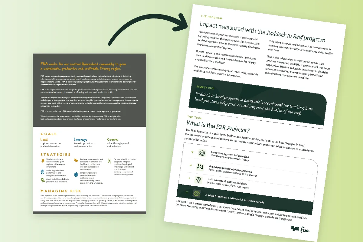
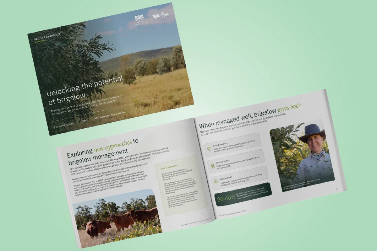
FBA had outgrown its brand. The organisation's approach to natural resource management had kept moving, but the visual identity hadn't kept pace, and it was starting to look dated next to the work it represented. We refreshed the brand to feel modern, warmer and more considered, building on what already worked rather than starting over, so it still looked like FBA, just sharper. It's grown into an ongoing partnership since, with the new brand rolled out across dozens of assets.
The brief.
FBA is a leader in natural resource management for central Queensland, and the work itself is genuinely innovative. The brand had stopped keeping up with it. Nothing was broken, they'd simply outgrown it, and the style had started to feel aged next to the organisation it represented.
They wanted a brand that better reflected their personality, connected with a wide range of audiences, and lined up with where the organisation was heading. It also had to work hard: holding together across every channel they show up in, print, digital and web, and flexing its tone for audiences as different as land managers, policy makers, researchers and the next generation of leaders. The brief wasn't to start again. They liked their palette and their style, and wanted to build on it, refine it, and lift it.
At a Glance
Client: FBA
Sector: Natural Resource Management, central Queensland
Scope: Brand refresh, colour palette, typography, brand attributes and tone of voice, brand graphics, plus ongoing design across print and digital.
Relationship: Ongoing since 2025
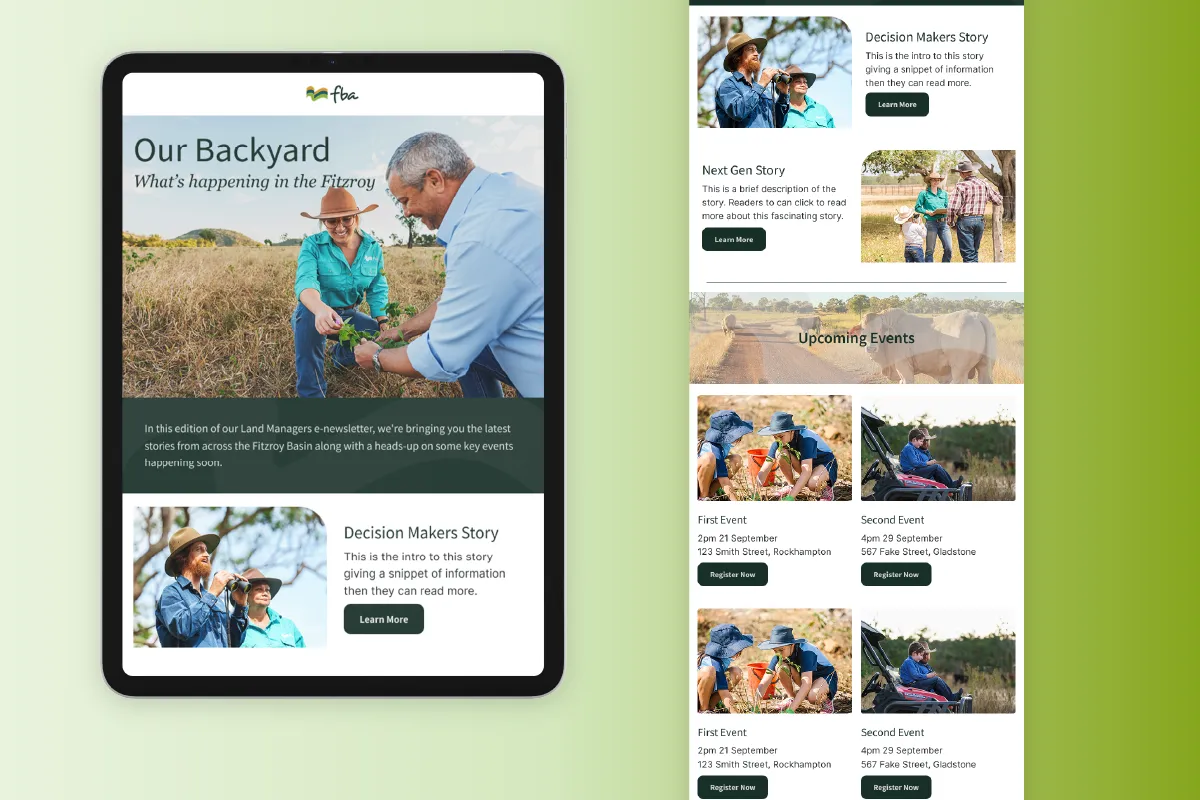
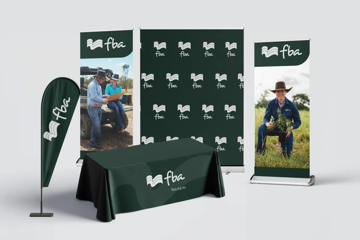
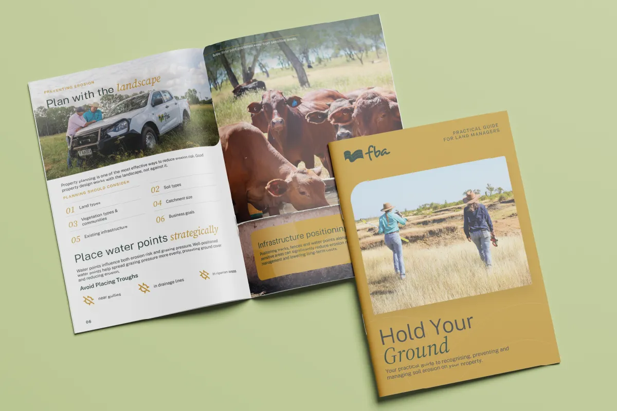
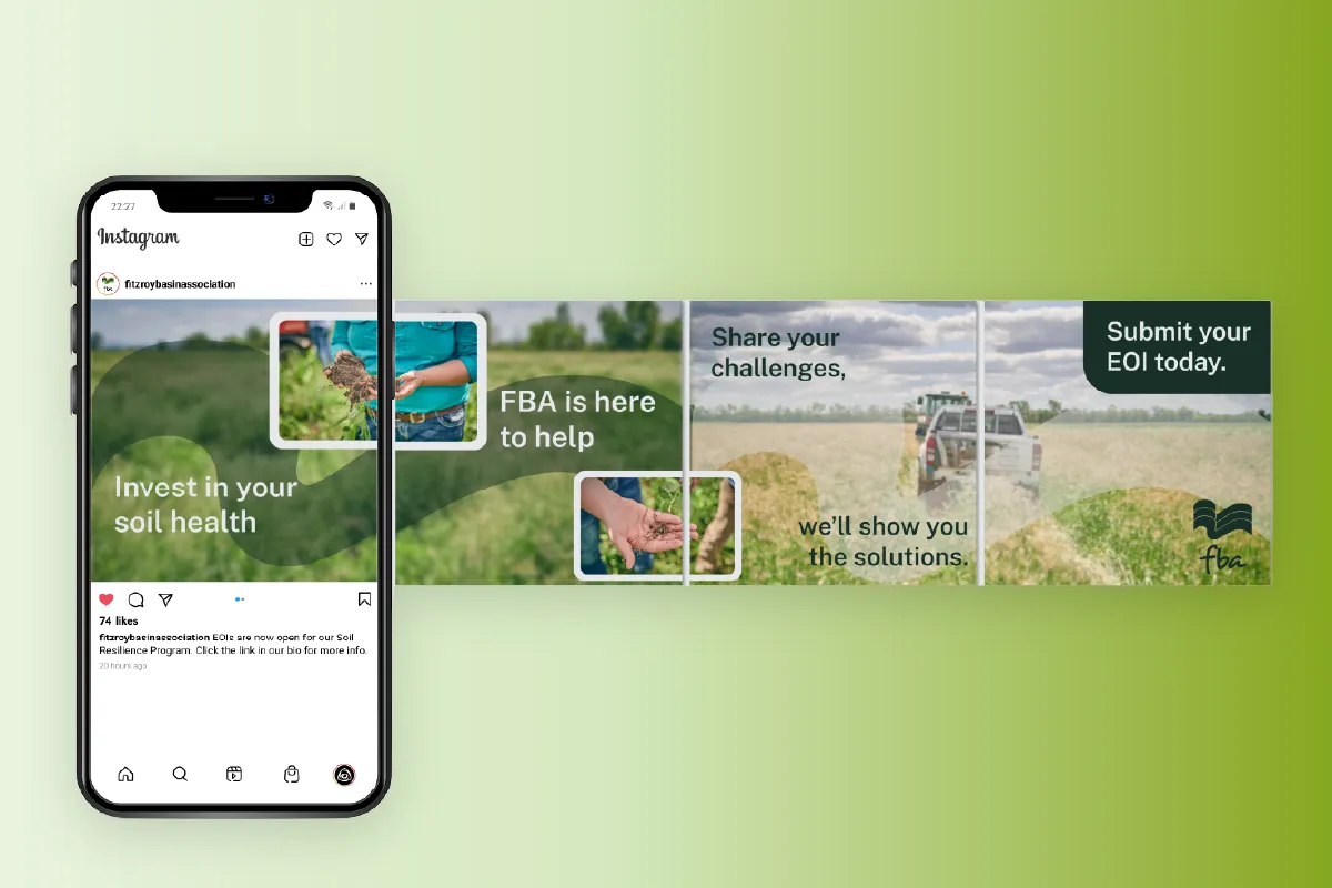
Since then: Annual reports, brochures, flyers, eventware, copywriting, social creative and video.
Our approach.
We started with the team, not the tools
01 - Moodboards.
We pulled together a spread of directions to get the conversation going, colour palettes, typography and graphic styles, as mood boards the team could react to rather than a blank page.
02 - Workshop.
We ran a workshop through it all together: what they liked, what they didn't, what they wanted to keep, and what they were willing to move on. That's where the real brief took shape.
03 - Concrete concepts.
We took that steer away and worked it into more concrete options, so the team was choosing between considered directions rather than vague ideas.
04 - Refine.
They chose a direction, we refined it together, and shaped it into the finished brand.

A palette, lifted.
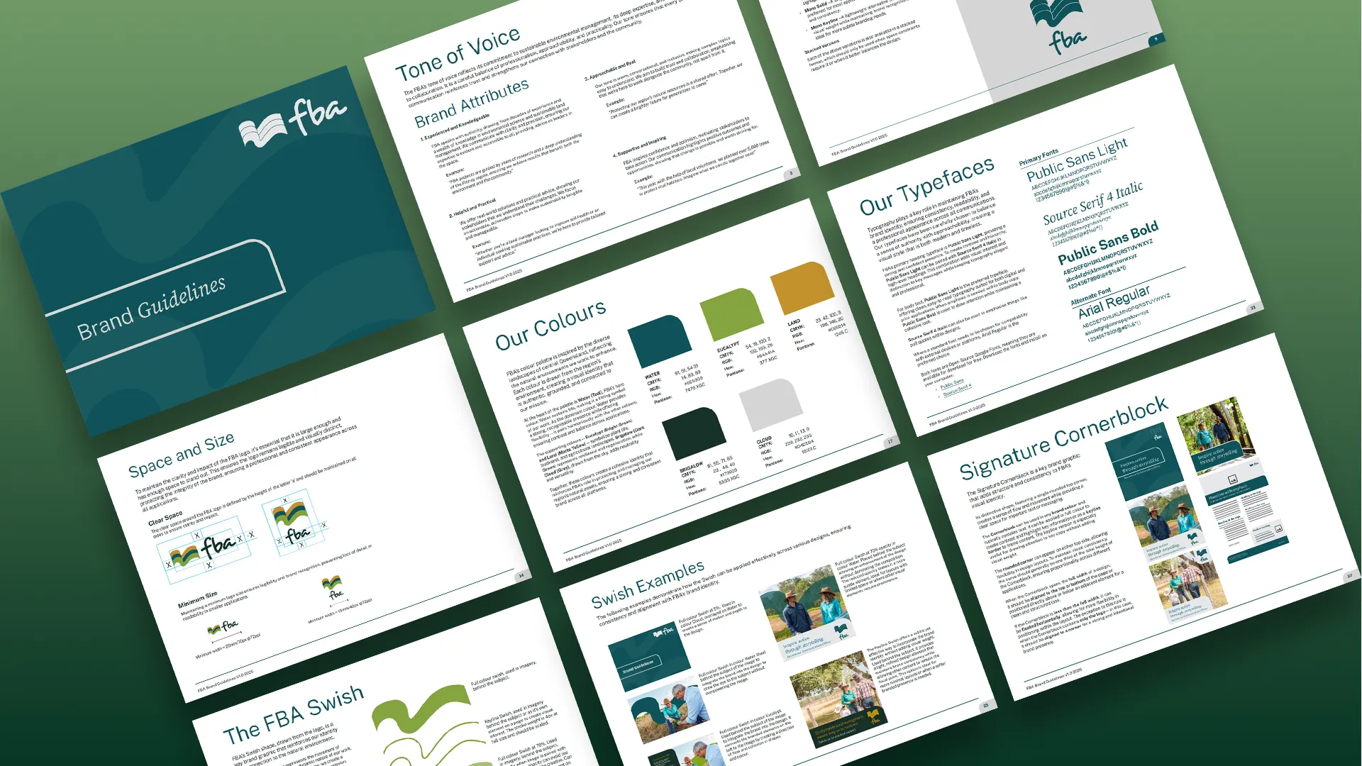
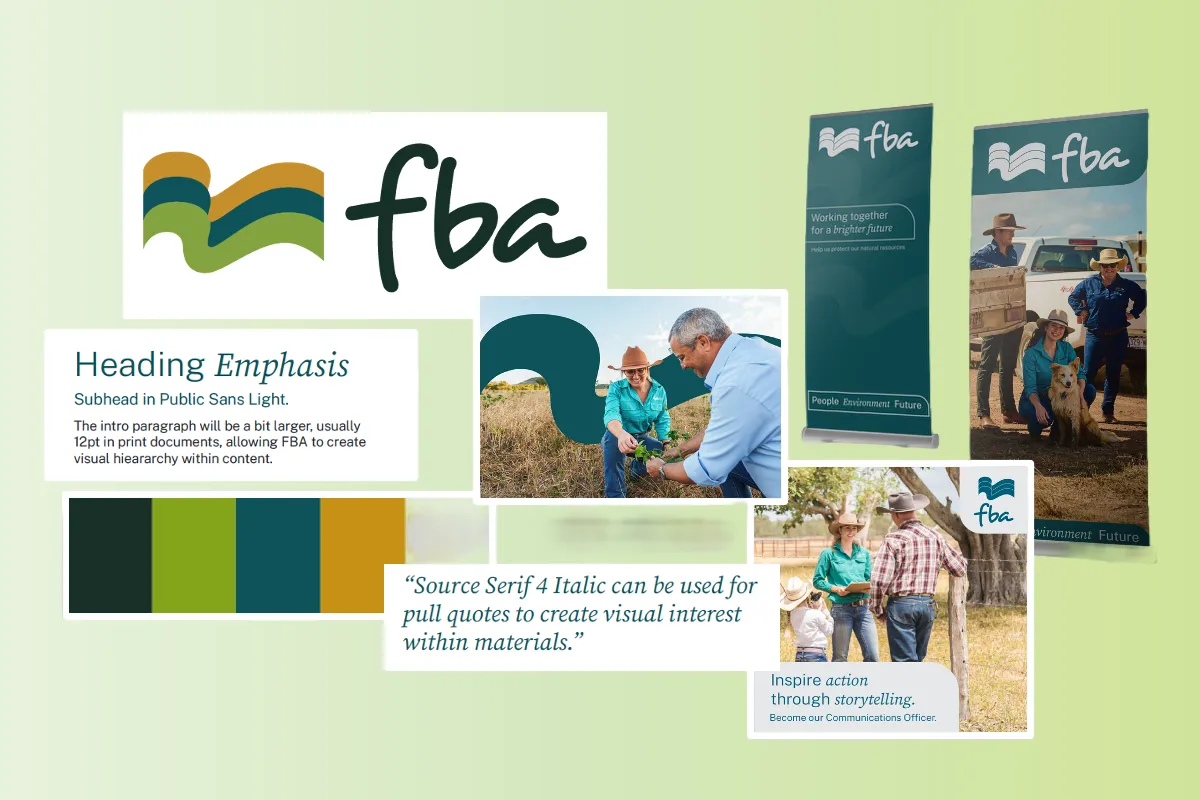
FBA's colours come straight from the central Queensland landscape, so replacing them was never the goal. We kept the identity intact and lifted it, warming and brightening the existing teal, green and yellow, and adding new shades to give the team more room to move. One of those, Brigalow, a rich green, went straight into the logo, replacing the flat grey it used before and instantly making the whole brand feel fuller. We also set out which colours pair safely for text, so contrast holds up for accessibility. The fuller palette means the brand can stretch from a formal report to a bright social post without ever looking like a different organisation.
Type with a clearer voice.
The old brand leaned on a handwritten font that had started to feel too casual for an organisation with FBA's authority. New typefaces did much of the modernising: Public Sans carries the headings and body with a clean, contemporary base, paired with Source Serif 4 in italic for emphasis and a touch of character. Together they feel more mature and considered, and both were chosen with accessibility in mind, so the brand reads clearly for everyone, on screen and in print.
A voice for every audience.
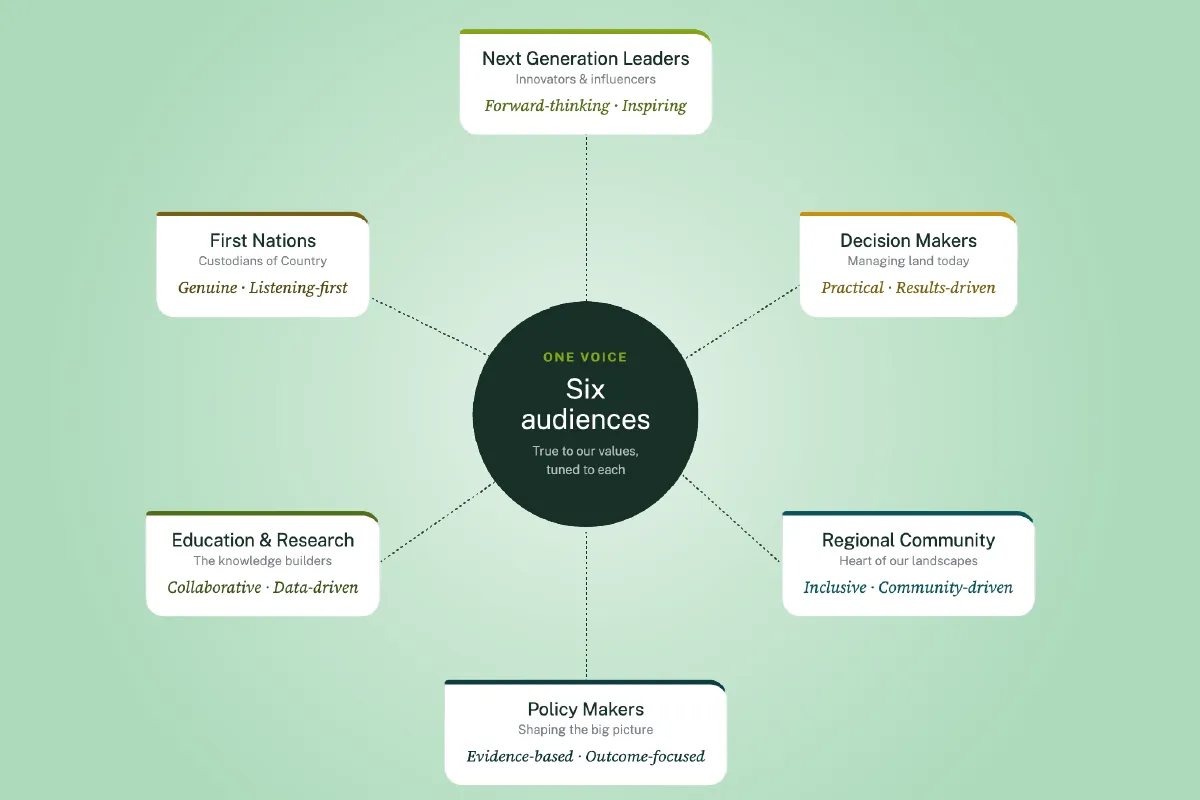
A brand isn't only how it looks. FBA talks to land managers, policy makers, researchers and the next generation of leaders, and one flat tone doesn't land with all of them. We developed FBA's brand attributes and a tone of voice built to flex, staying recognisably FBA while shifting to suit who's on the other end: warm and plain-spoken for the community, evidence-led for decision makers, forward-looking for the innovators.
Graphics that tie it together.
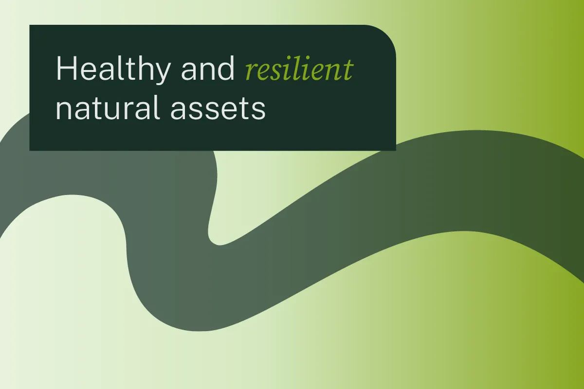
Two brand graphics give FBA a signature that carries across everything. The Swish, drawn straight from the logo, echoes the movement of water through the region and adds depth behind imagery. The Signature Cornerblock, a panel with a single rounded corner, holds key messaging and frames content. They're small devices, but they're what make a flyer, a report and a social tile instantly read as FBA.
Everything Put Together
Eyebrow Text Here
Where it landed.
FBA came away with a brand that finally matches the organisation behind it: warmer and more modern, and flexible enough to handle every audience and channel they work across, while still looking like the FBA people already knew.
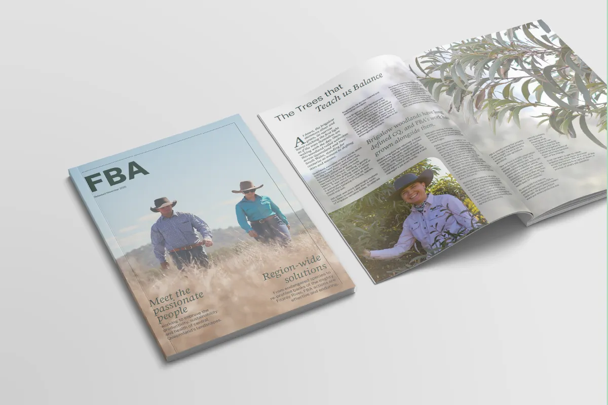
And it didn't stop at a guidelines document. Since the refresh we've stayed on as FBA's design partner, bringing the brand to life across dozens of pieces in print and digital, annual reports, brochures, flyers, eventware, social creative and video among them. A refresh proves itself in how it holds up out in the world, and this one keeps proving it, still shaped by the same people who built the brand.
"From day one, Kat felt like a natural extension of our team at FBA, collaborating seamlessly with our internal stakeholders, quickly grasping our brand vision, and not just meeting expectations, but exceeding them. Her eye for branding and design is exceptional. She didn't just refine our materials, she elevated them, bringing a level of polish and professionalism that truly made an impact. At FBA, we see Upstart Lane as a trusted partner and a key asset in our creative and digital marketing efforts. They're not only talented, but also a joy to work with, and we recommend them wholeheartedly."
Karlie Williams • Social Impact Leader, FBA.