Emu Park Chiropractic
Eyebrow Text Here
A clinic made her own.
When Dr Zoe Jones took over Emu Park Chiropractic, she wanted to make it hers, without throwing away the trust the clinic had already built in the community. There wasn't much of a brand to work with, just a simple graphic of a spine and no proper logo. We used that as the starting point and grew a full identity from it, a logo, an ocean-inspired palette, type and brand guidelines, then carried it through to a new website and the clinic itself. We've stayed on as her design partner since.
The brief.
Dr Zoe Jones had just taken over Emu Park Chiropractic, and she wanted to put her own stamp on it. The trick was doing that without losing what the clinic already had: years of trust and recognition in a small coastal community. A brand-new look that ignored all of that would have meant starting from zero on the thing that mattered most.
There also wasn't much to build from. The clinic didn't have a proper logo, just a simple graphic of a spine. But Zoe liked it and wanted to keep it in the picture. So the brief was clear: take that one familiar element and grow a proper brand around it, something that felt like Zoe's, and still felt like the clinic Emu Park already knew.
At a Glance
Client: Emu Park Chiropractic
Owner: Dr Zoe Jones
Sector: Chiropractic and allied health
Scope: Logo, colour palette, typography, brand guidelines, Wix website, signage, stationery and ongoing marketing.
A logo, at last.
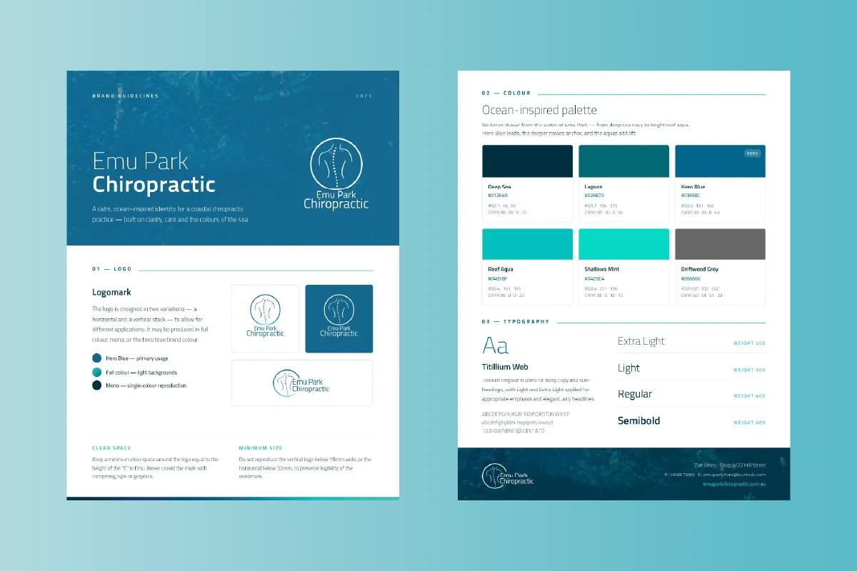
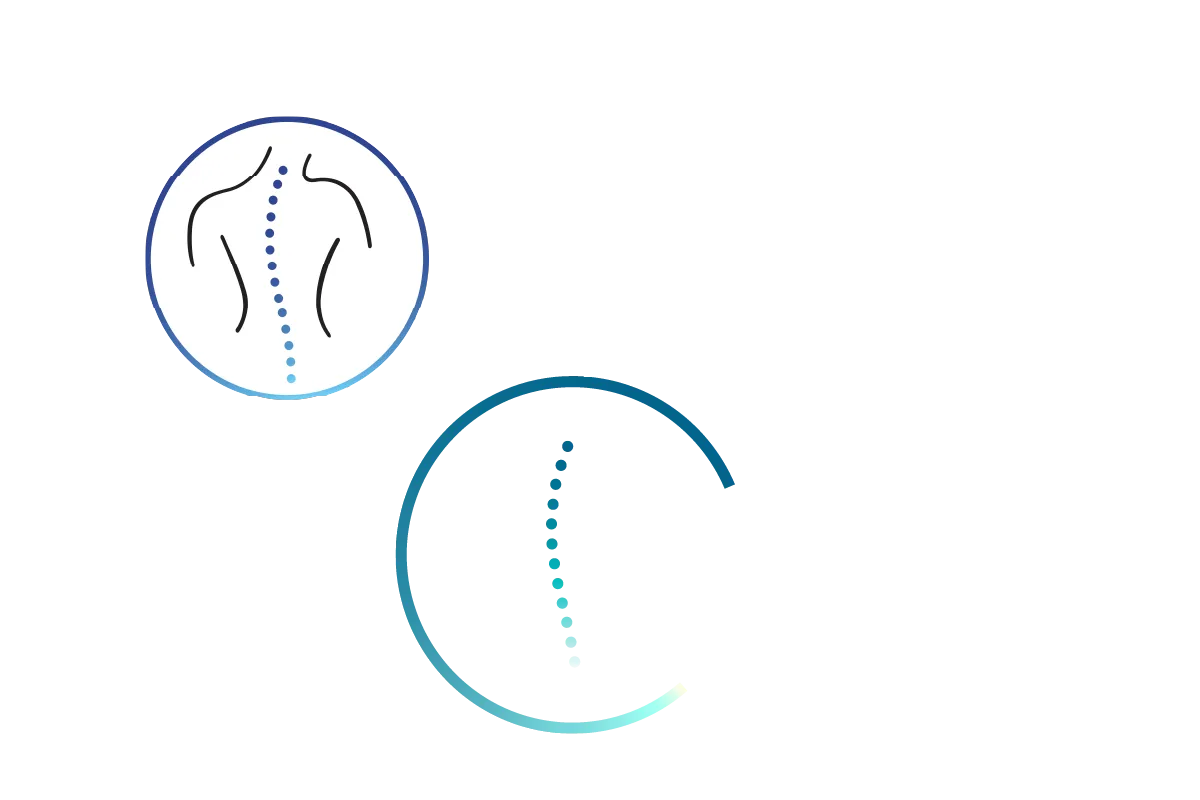
We started with the one thing worth keeping. The clinic already had the spine graphic, so rather than replace it, we kept it, refreshed its colours to fit the new palette, and connected the clinic name to it. That small move turned a loose graphic into a proper logo, one that works at any size and in any setting. It comes in horizontal and vertical lockups for different spaces, and in full colour, mono, or the hero blue, so it holds up on everything from a street sign to a business card.
An ocean palette.
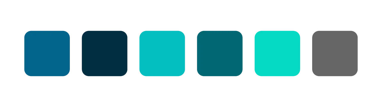
Emu Park is a seaside town, so the palette took its cue from the water. Blues and aquas run through the brand, the kind of colours that quietly signal health, calm and trust, which is exactly what you want a patient to feel walking into a chiropractor. A deep hero blue anchors it, with brighter aqua tones to lift it.
Type, and a brand to run on.
Titillium gives the brand a clean, modern voice, with lighter weights for a softer touch where it suits. We pulled the logo, palette and type together into a set of brand guidelines, so everything the clinic puts out stays consistent, whether we make it or Zoe does.
A website that does the booking.
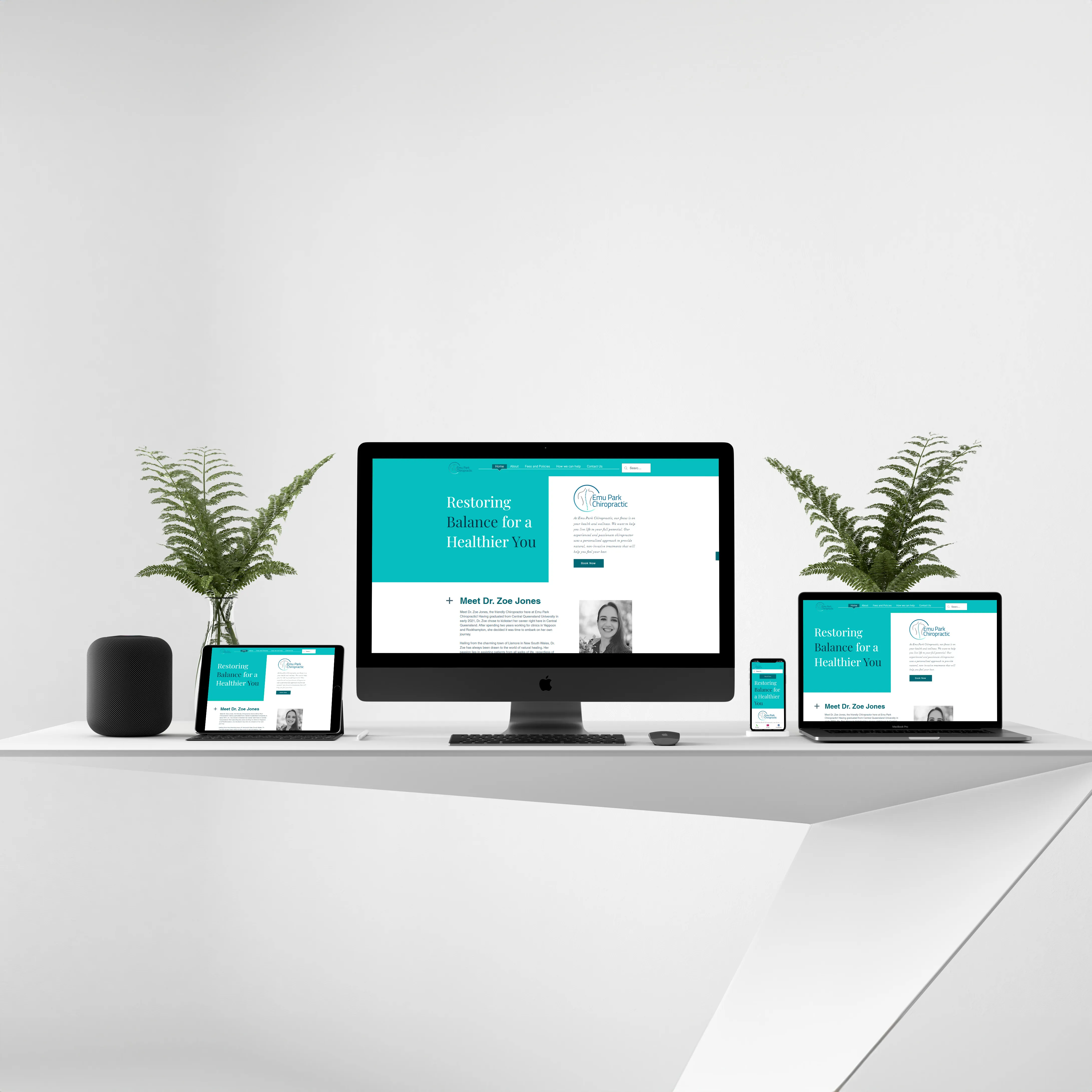
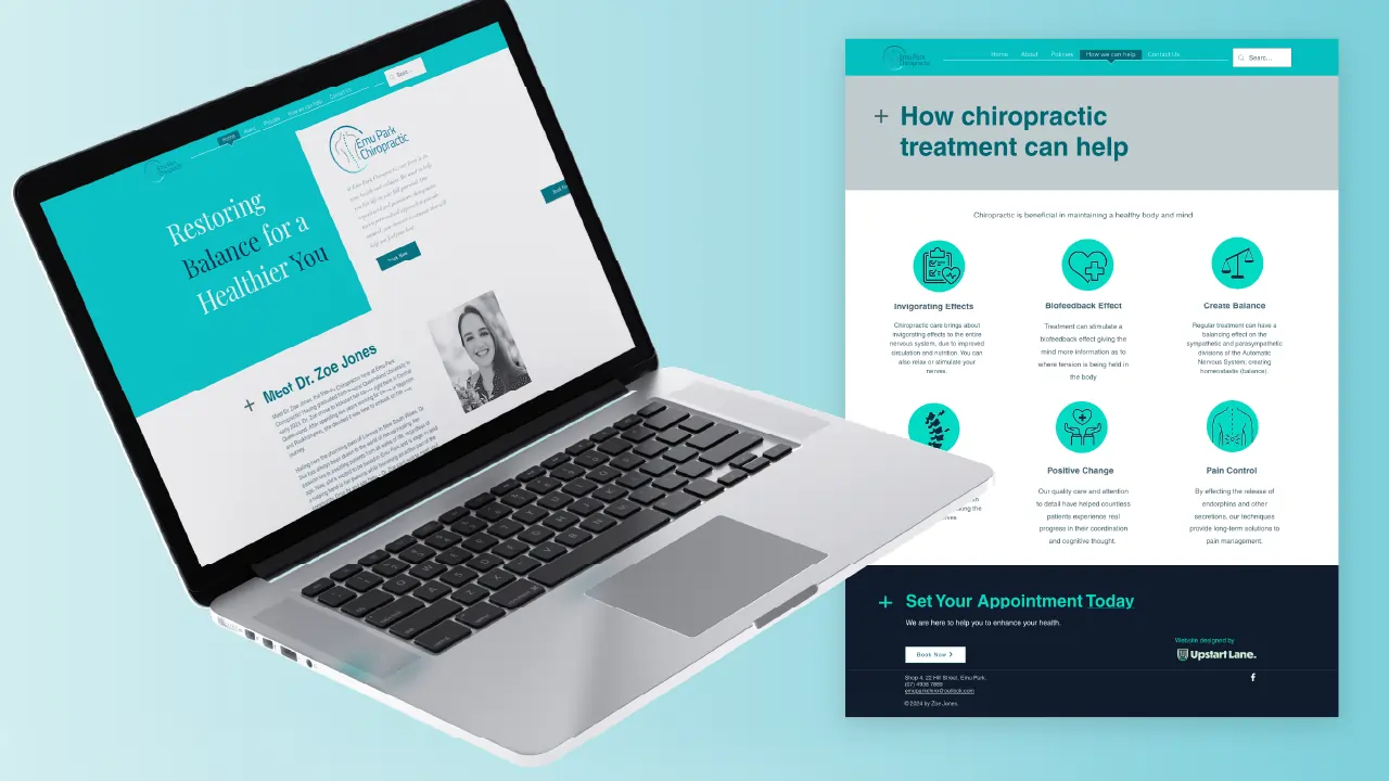
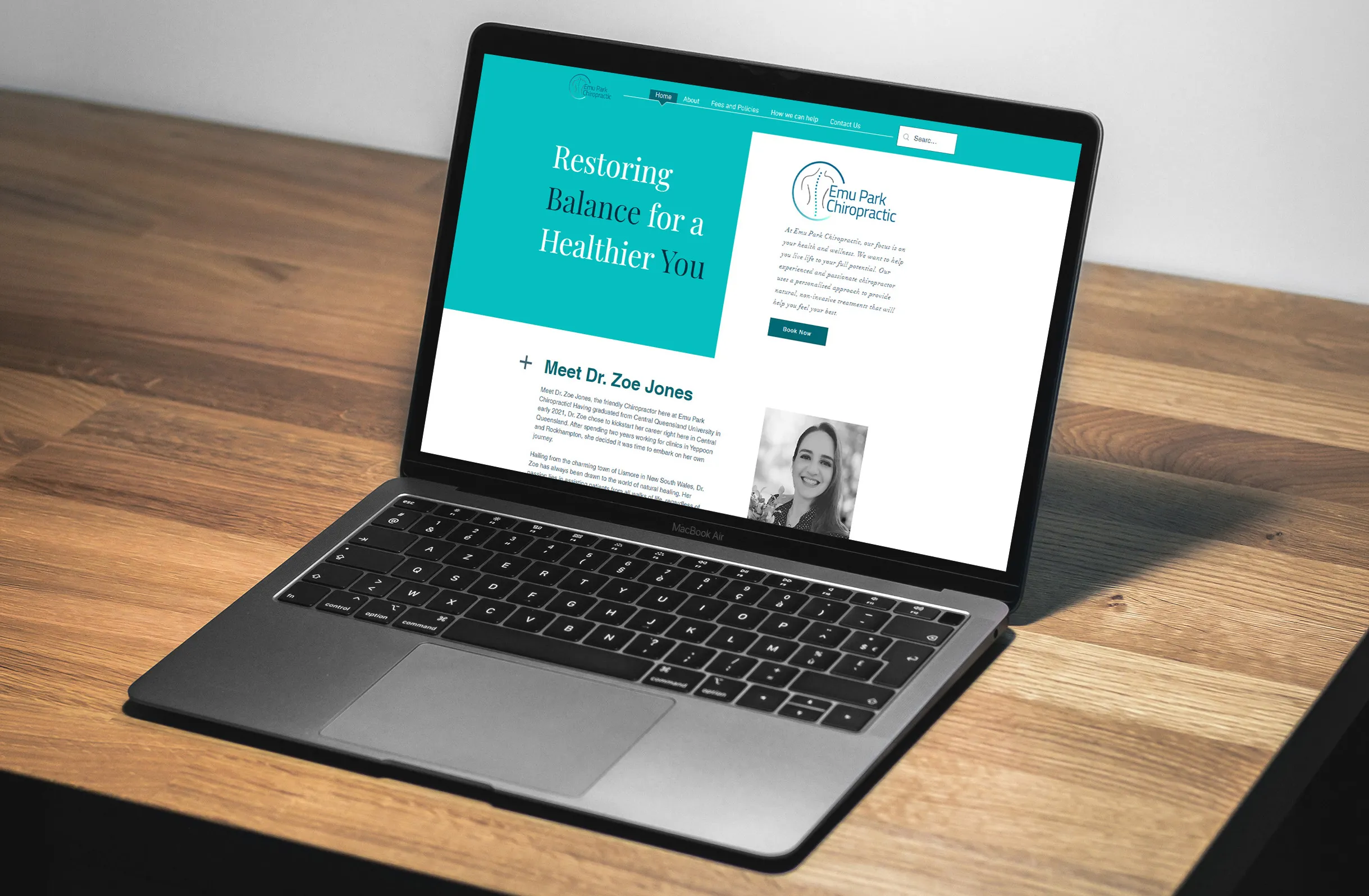
With the brand set, we built Zoe a website on Wix that shows what the clinic is really about: her holistic approach to health, in the new brand. Just as importantly, it does a job. The site links straight to her online booking platform, so a visitor can go from reading about a treatment to booking one in a couple of taps, no phone tag, no back and forth.
Put in Practice
Eyebrow Text Here
Brought into the clinic.
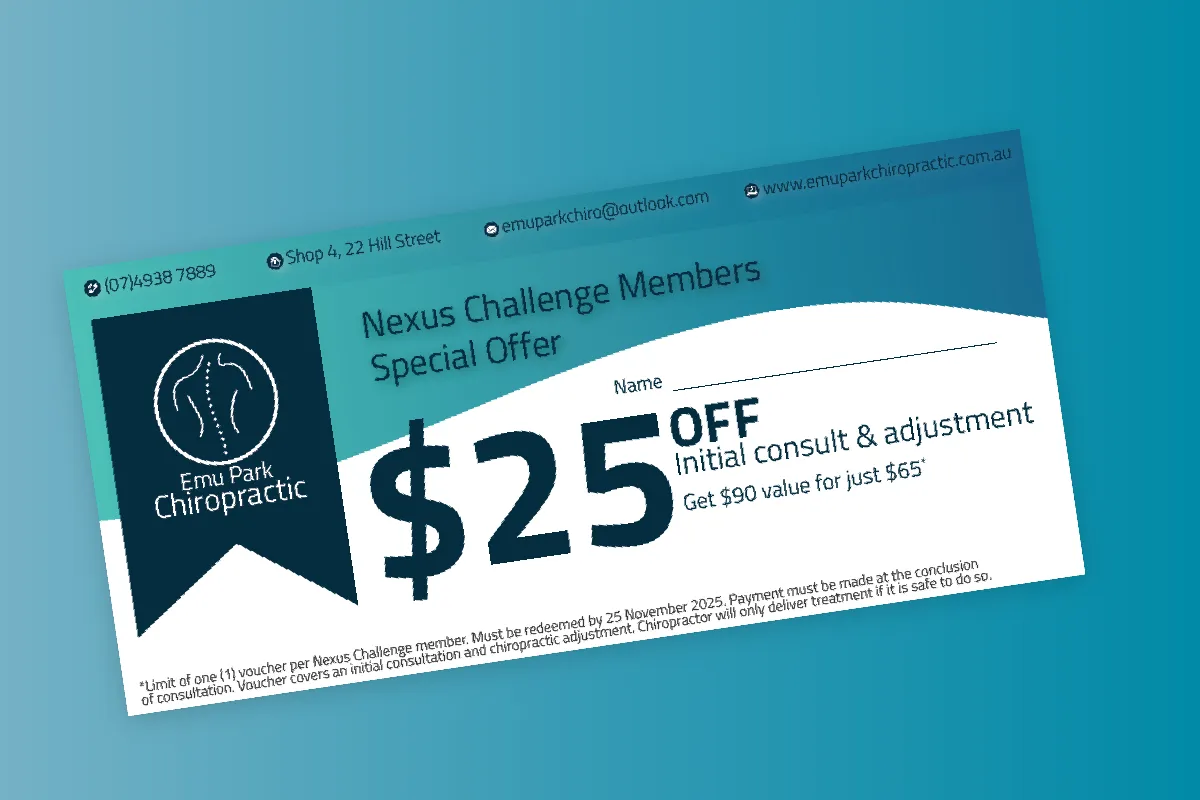
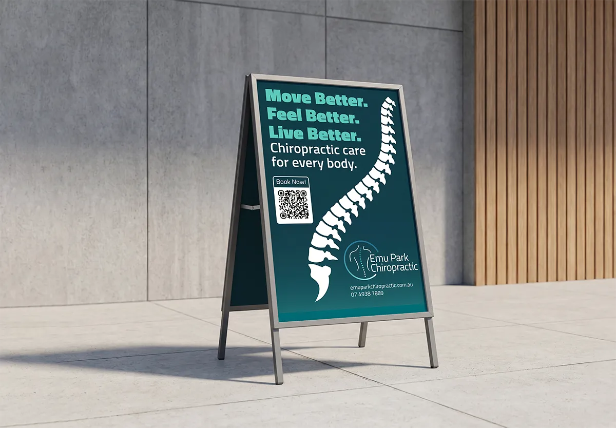
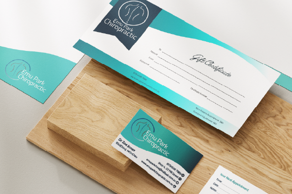
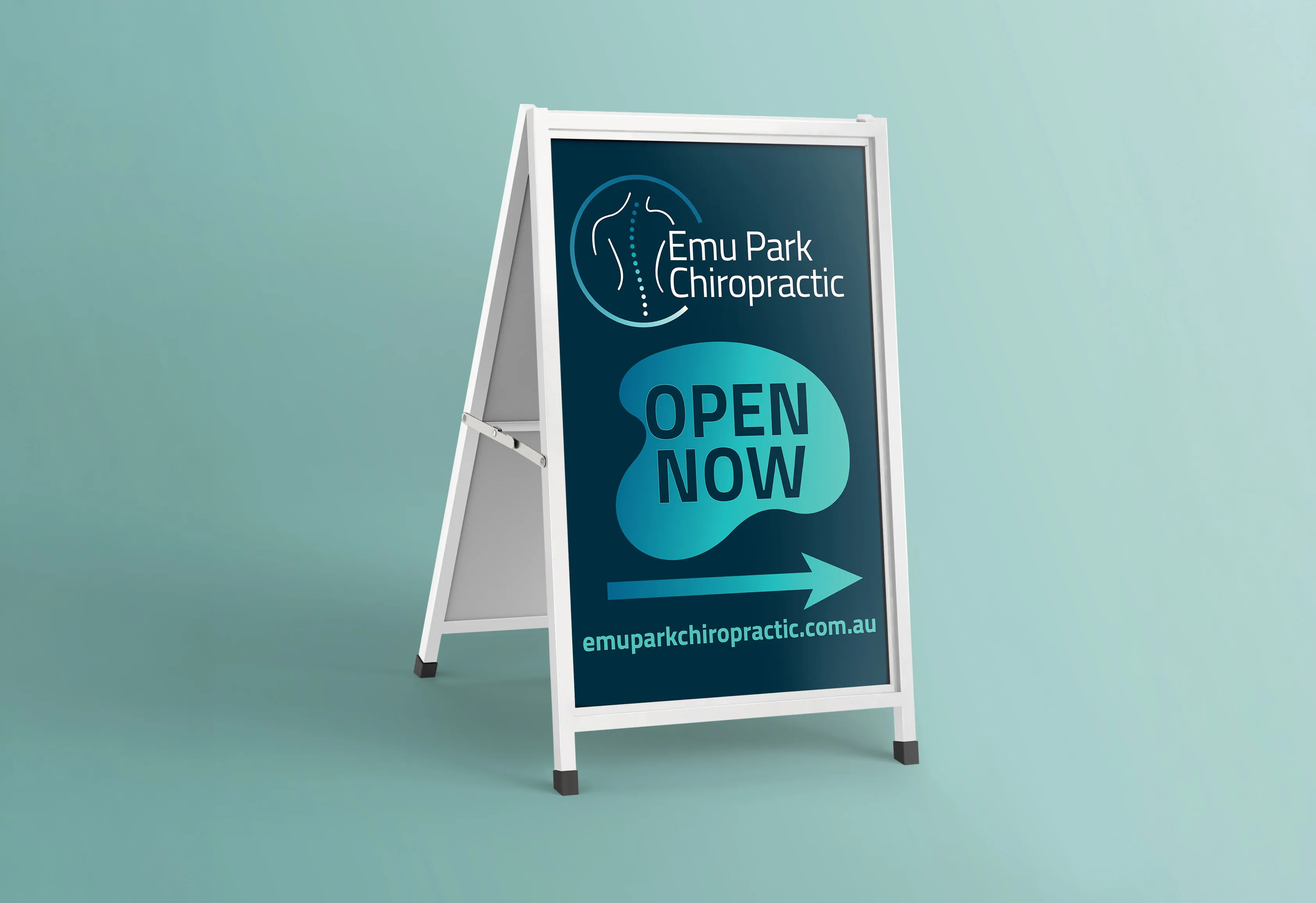
A brand only feels real when you can see it in person. We rolled it out across the clinic with new signage, and into patients' hands with a full set of stationery, business cards, letterhead, gift vouchers and the rest. The same identity, consistent from the website to the front door.
Where it landed.
Dr Zoe came away with a brand that's properly hers, built on the trust the clinic already had rather than starting over. And it didn't end at launch. We keep helping with marketing materials as they come up, so the brand stays consistent as the clinic grows. One clinic, one brand, working the same online, in print, and on the wall.
"Working with Kat has made my work life stress free! I gave her a brief description of what I was thinking and she promptly came back to me with incredible designs. Kat was professional and insightful and nothing seemed 'too much' for her. I can't recommend Upstart Lane enough."
Dr Zoe Jones • Emu Park Chiropractic